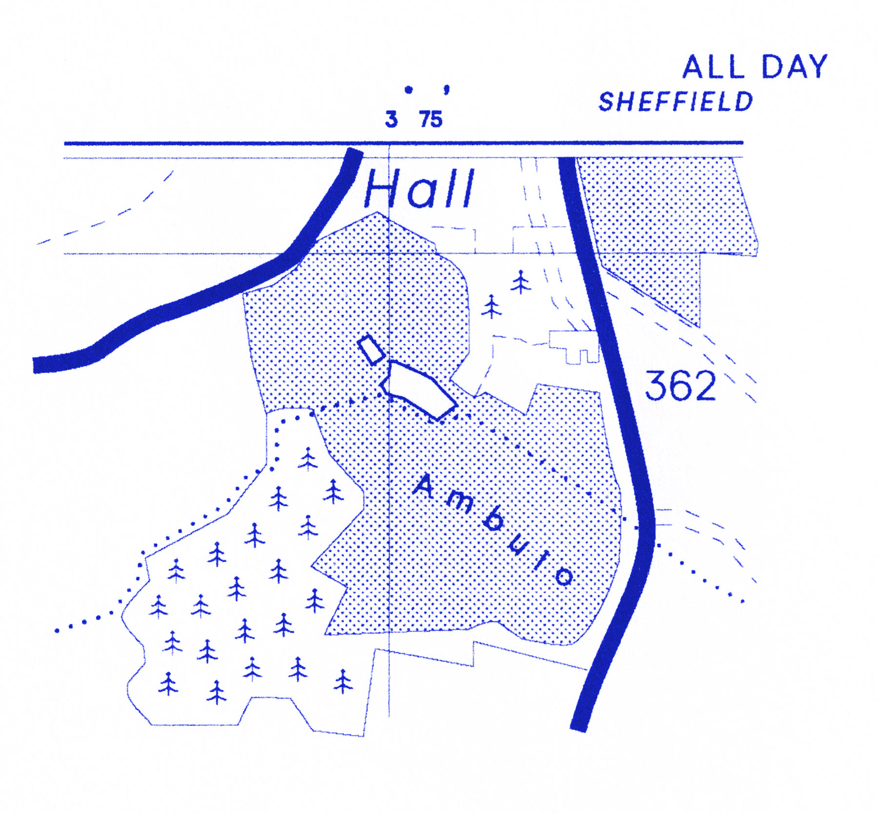
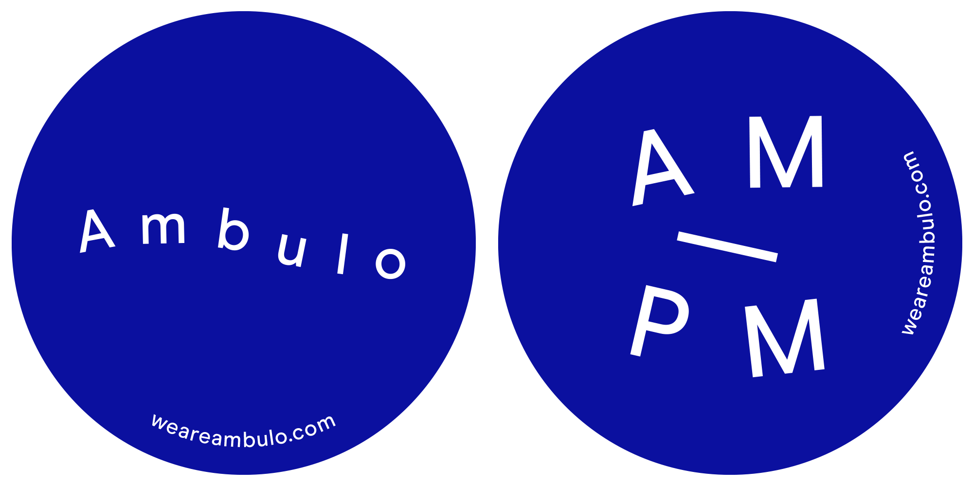
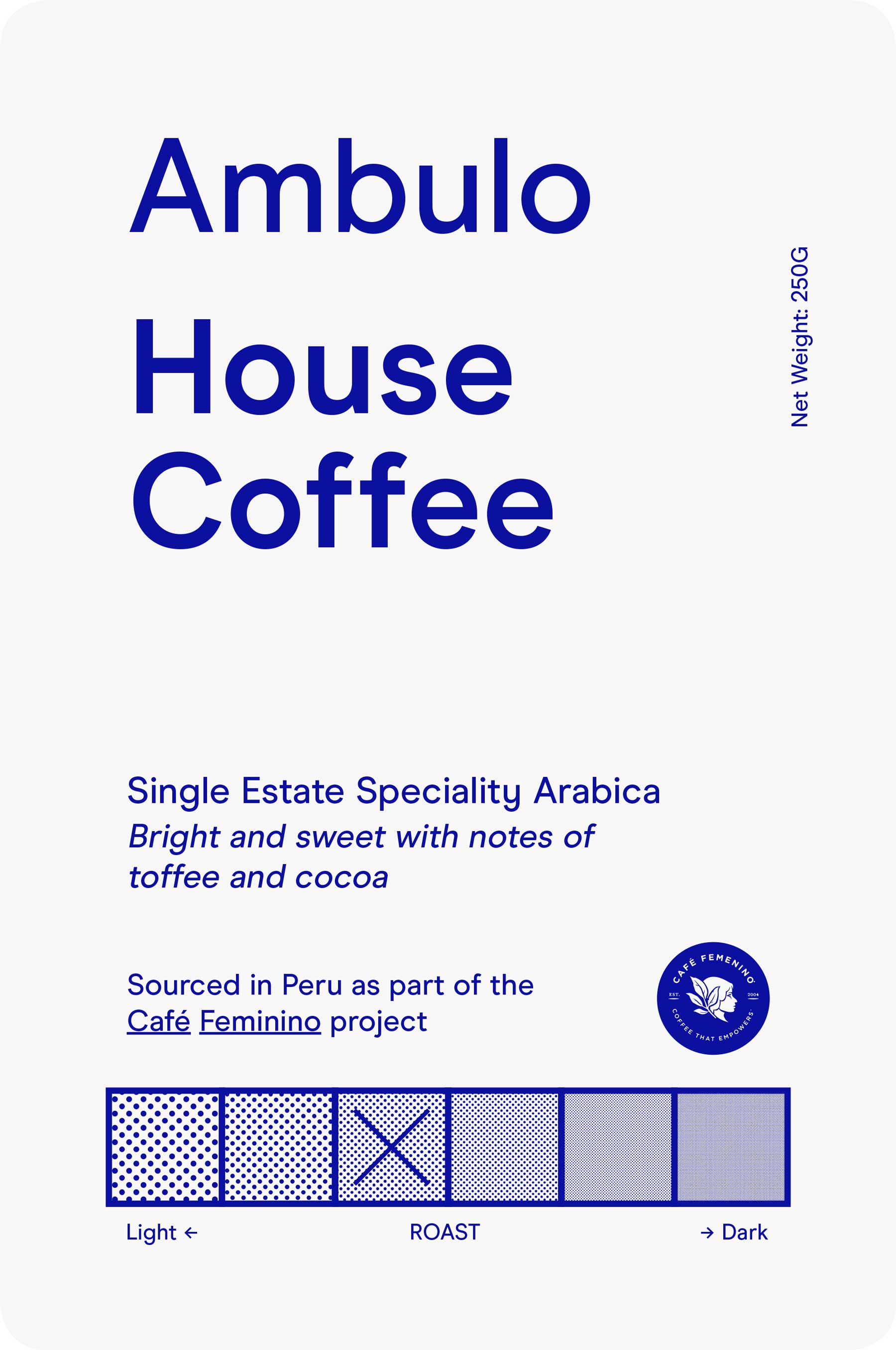
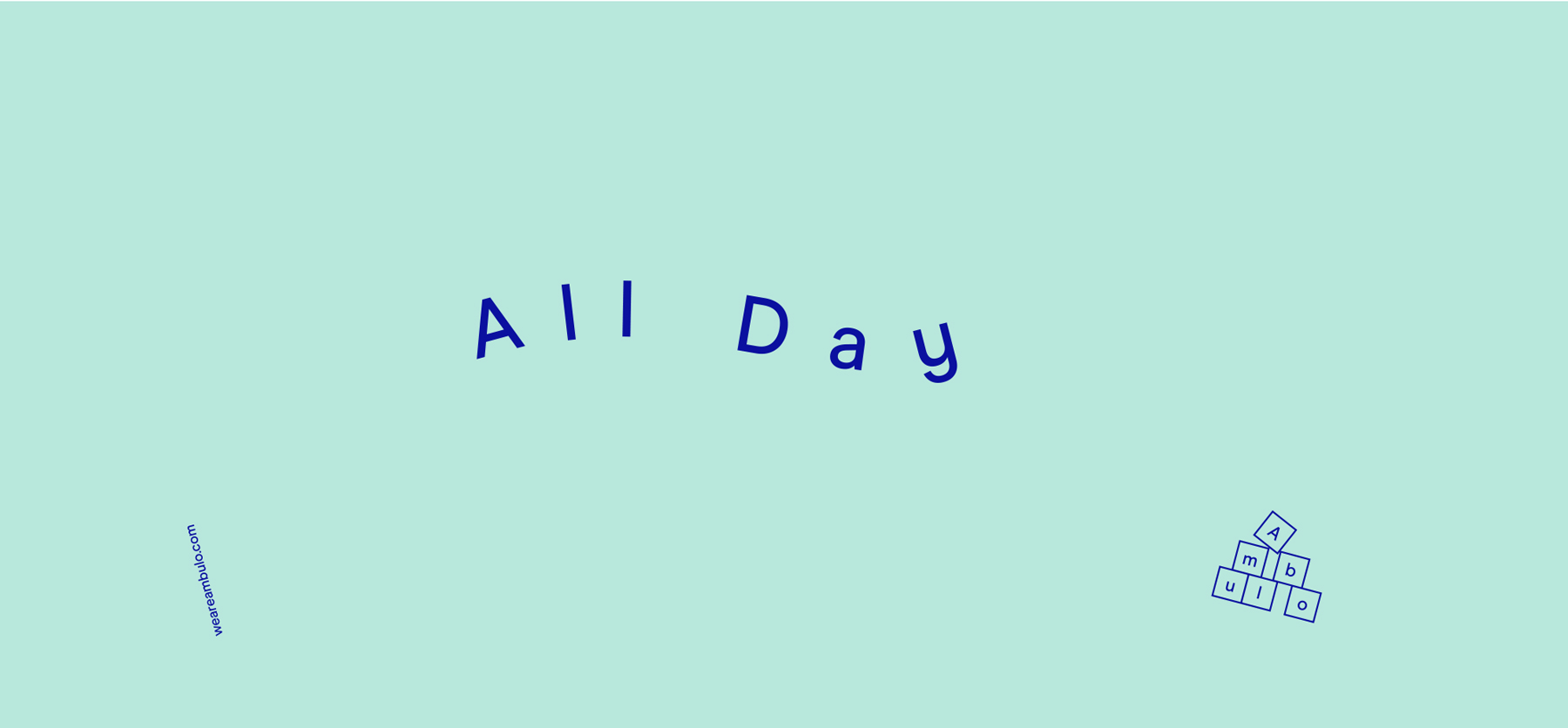
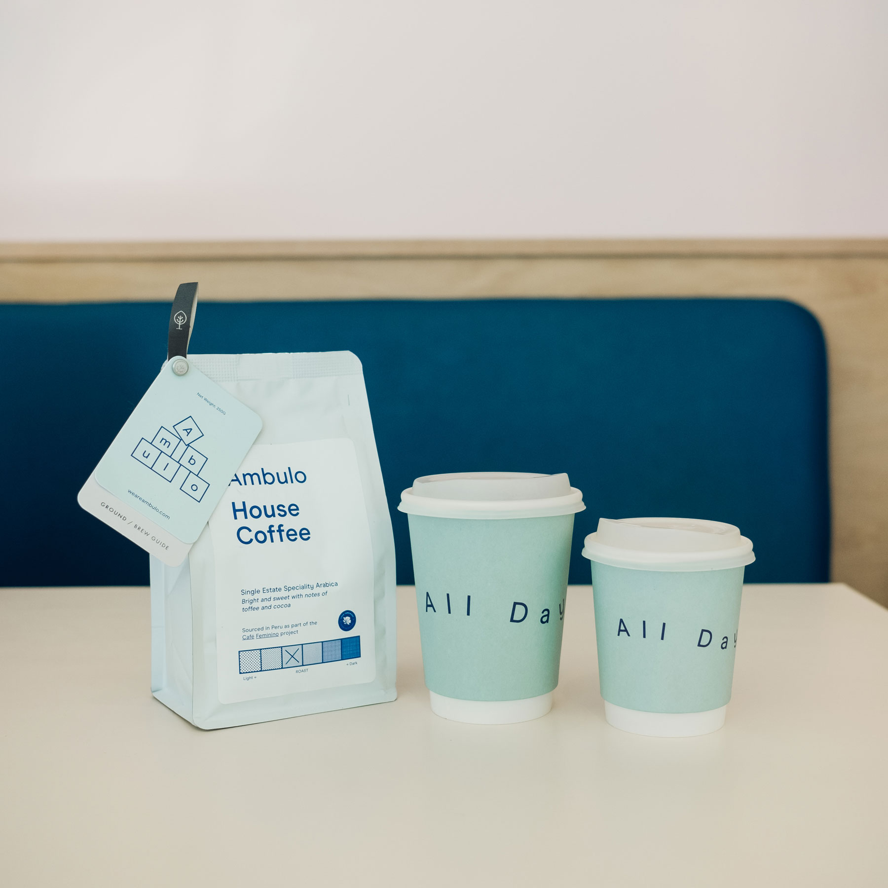
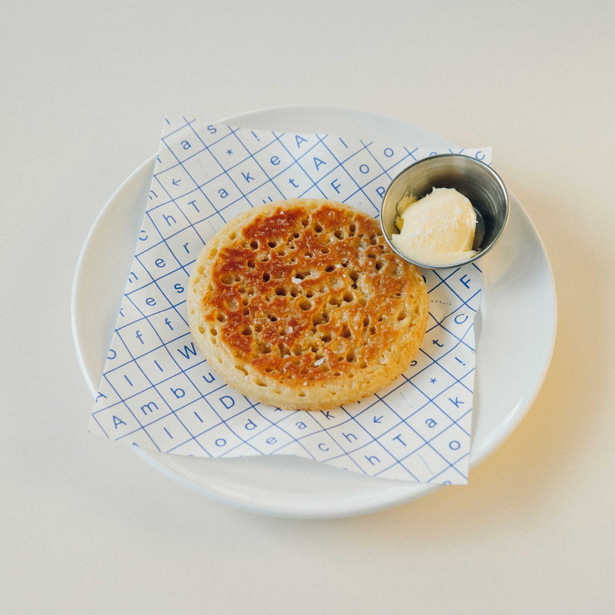
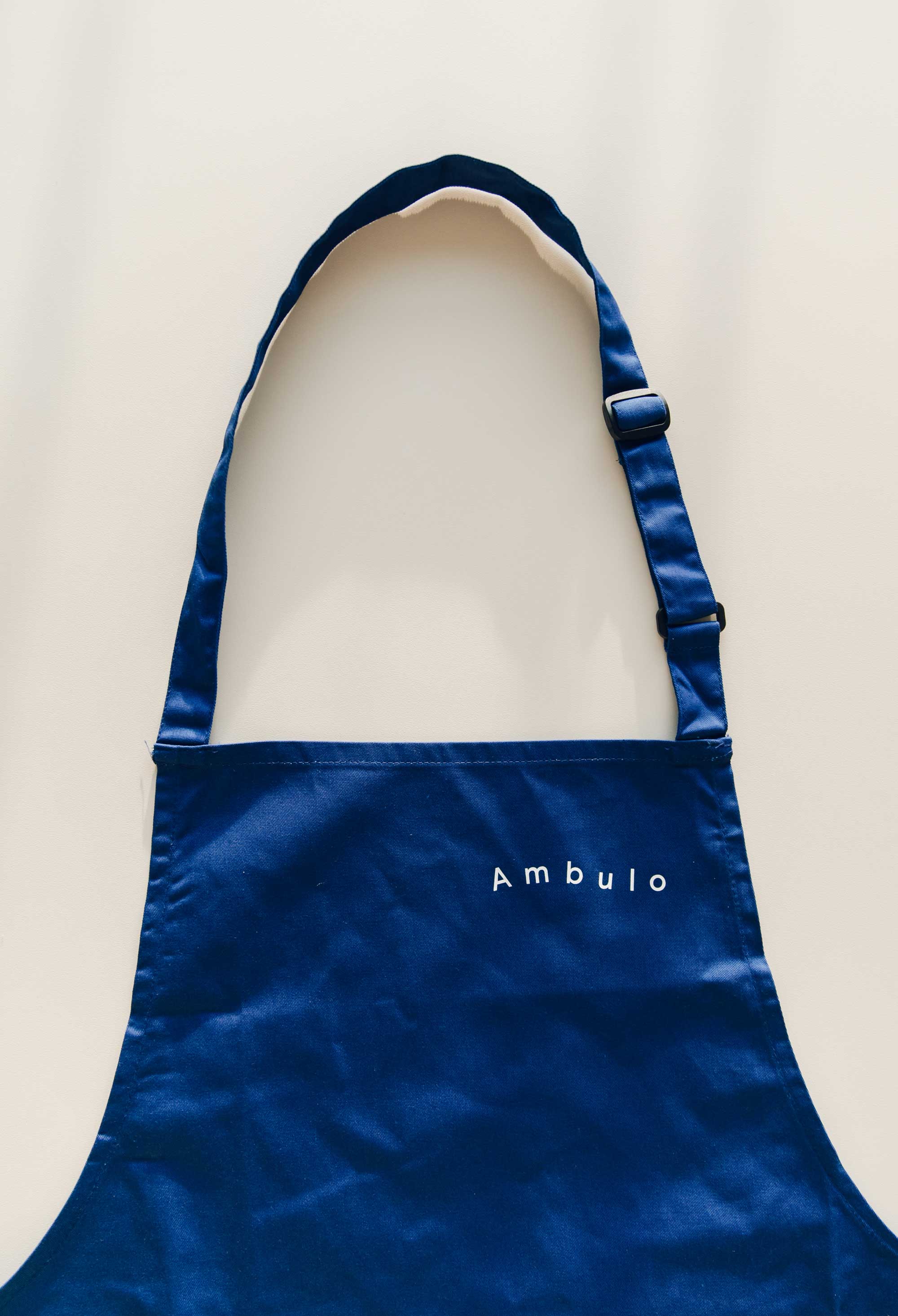
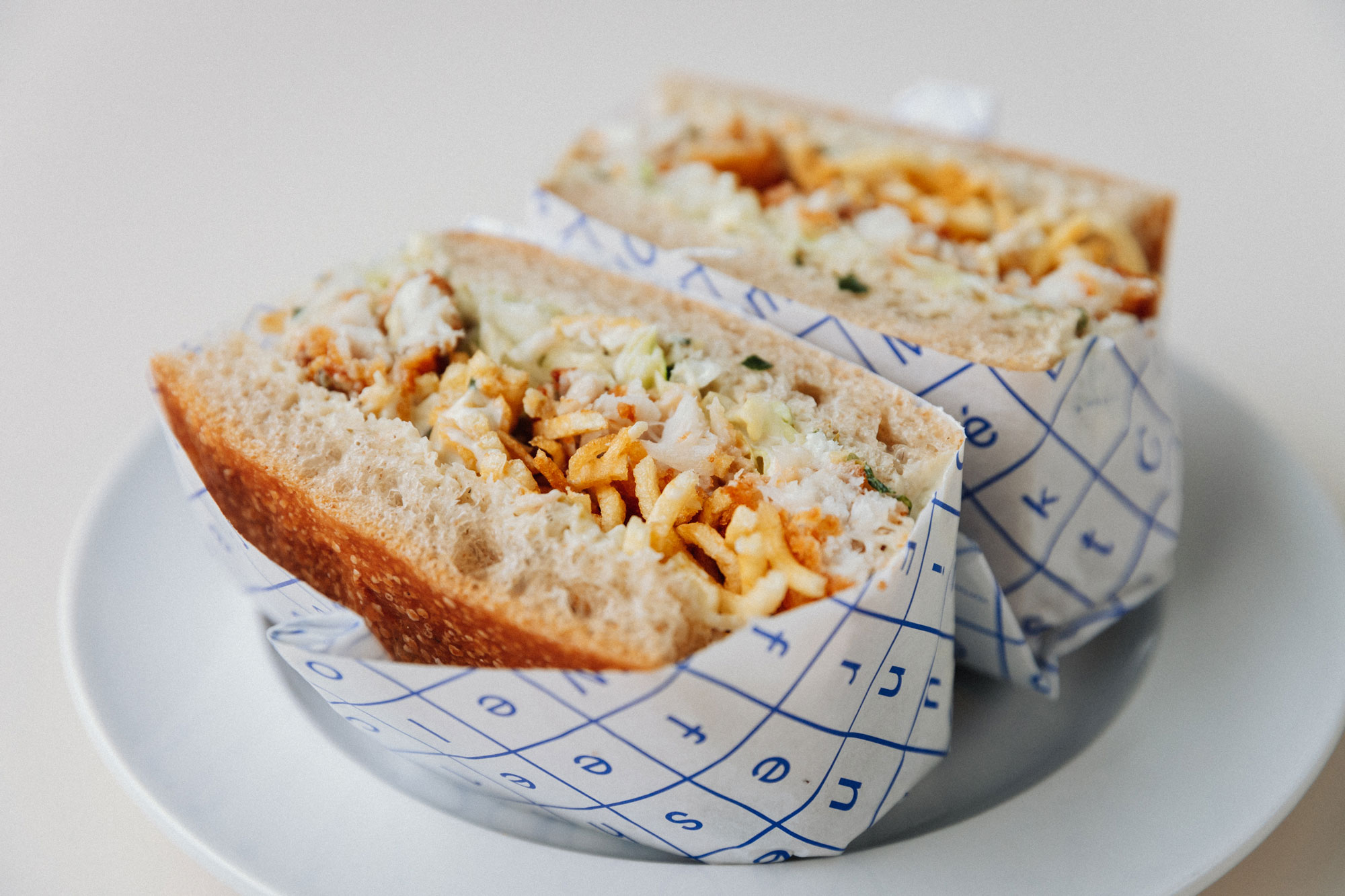
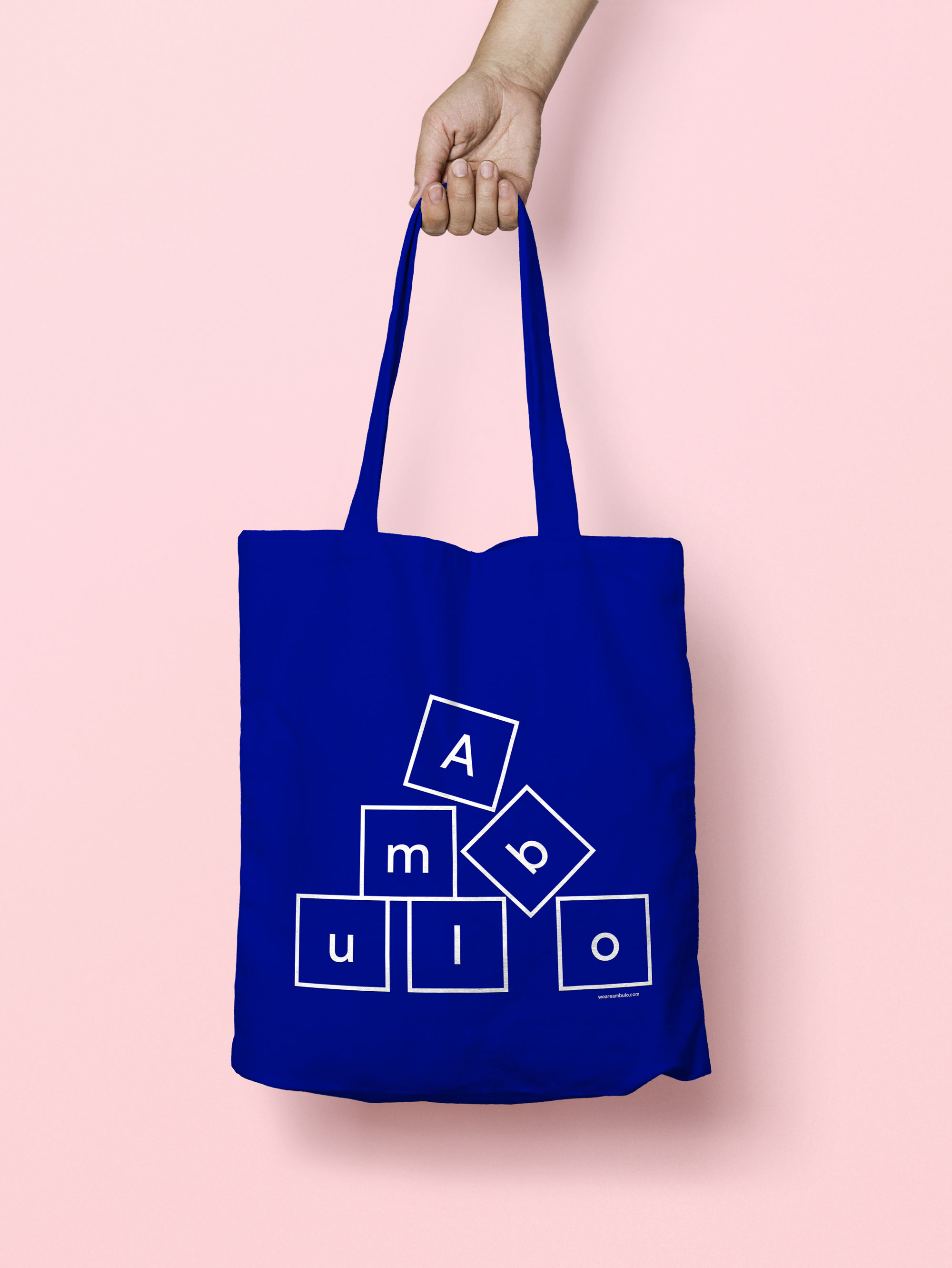
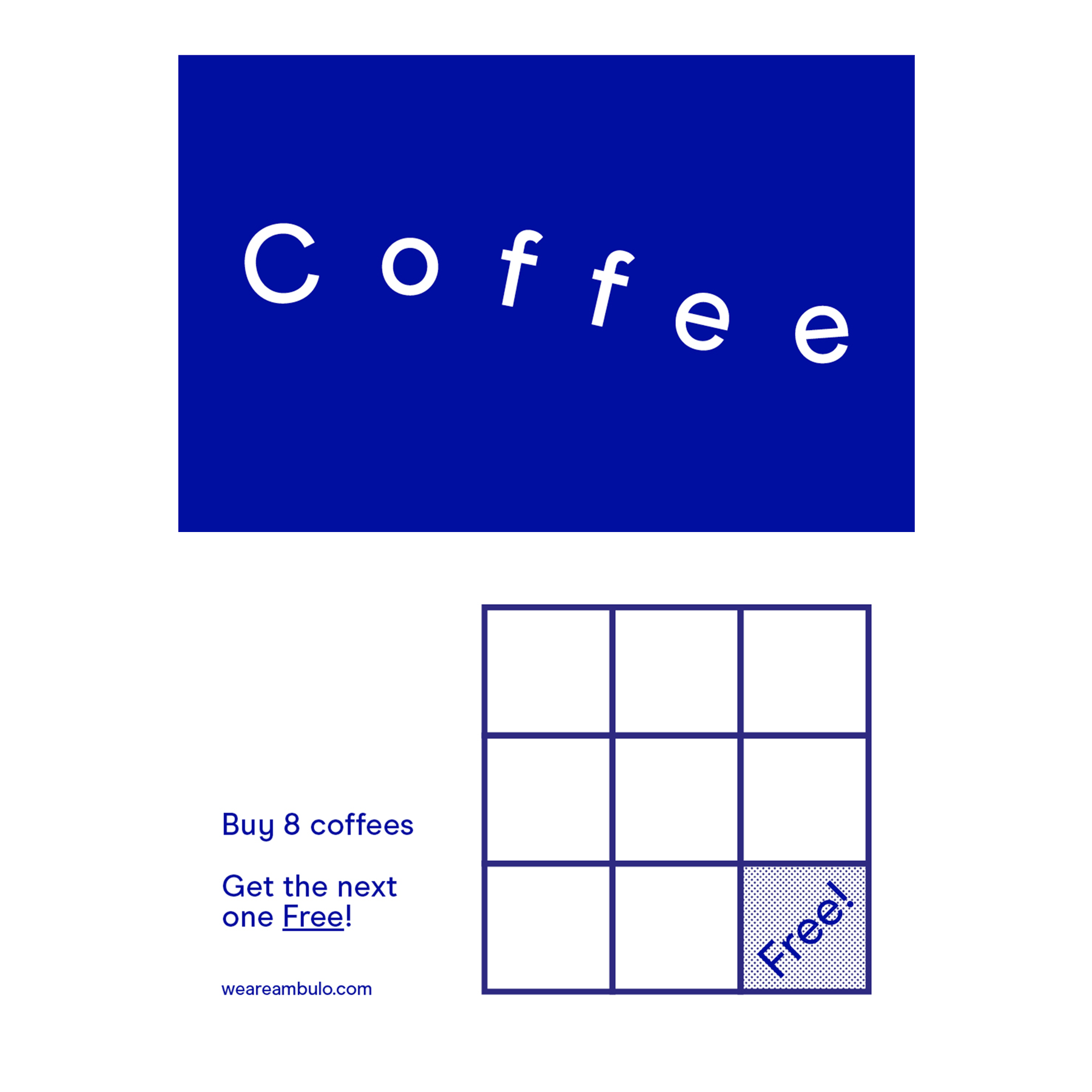
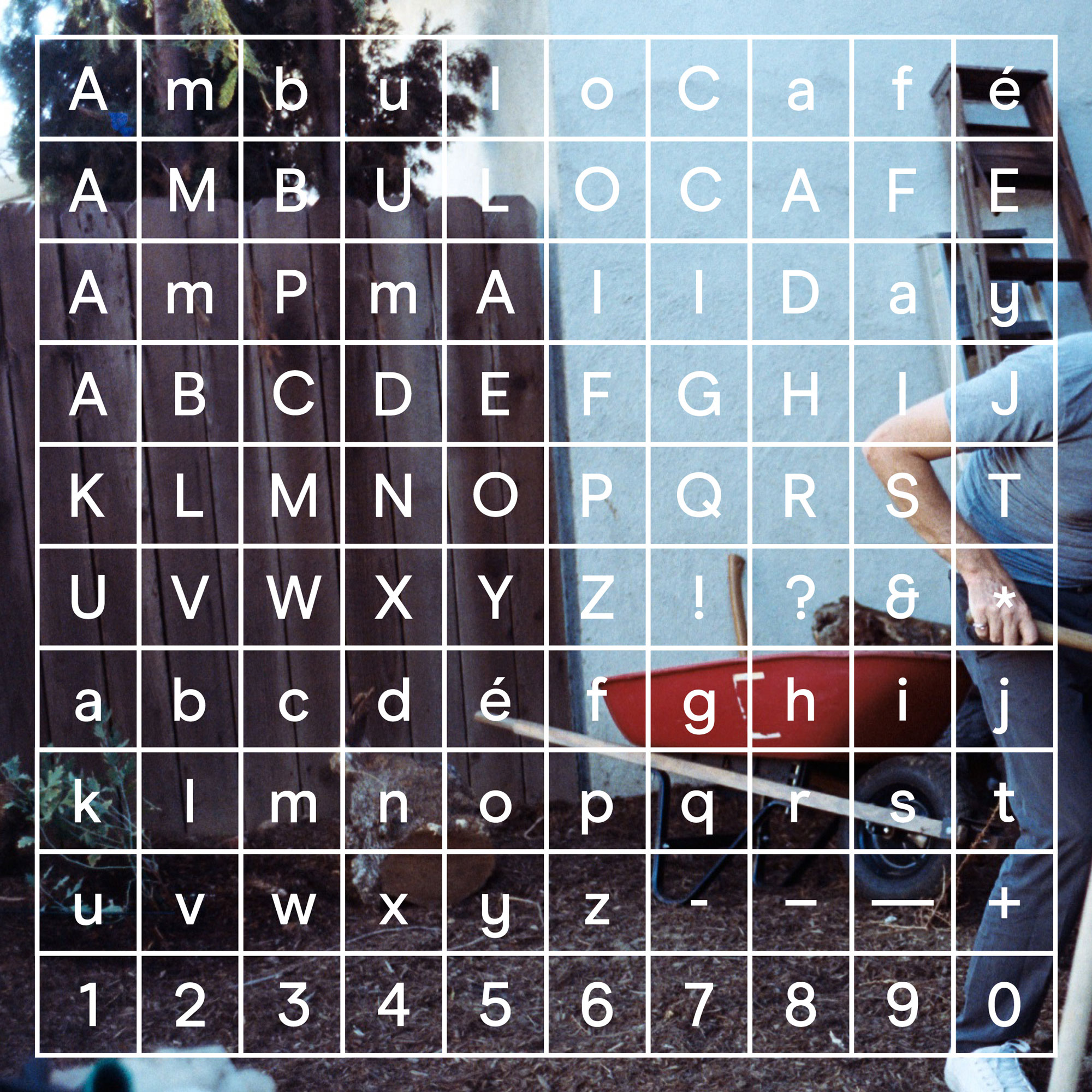
One of the formative concepts for Ambulo was the notion of travel and communicating that through a changing offering of food. Map lettering can be playful when fitting within a particular terrain and we considered how this undulation could reference travel and movement. The map was also referenced with a grid to create a uniform but still flexible alternate visual language. The contrasting yet symbiotic dialects provide an elastic and open visual identity. Design, art direction and brand identity by Totally Okay.